Super Purposes - Website Redesign
UX Methods
User Personas, User Interviews, Affinity Mapping, Wireframing, Competitive Analysis, Continuity Report, User Survey, Concept mapping, Affinity Diagramming
Role(In Team)
Lead UX Designer
Tools
Figma, Miro, Usertesting
Duration
10 months
Background
Super Purposes is a career coaching online platform that provides step-by-step guided courses to individuals looking to land a dream job. Unlike other online courses that target individuals based on whom they want to become, Super Purposes builds an emotional connection with clients by aiming at who they already are thus providing them with a detailed strategy as to how to achieve their career goals.
Problem
Low course purchase rates prevent Super Purposes from becoming a sustainable business that generates income. Early UX research initiatives uncovered inconsistency across the website; users found SP’s unconventional approach unprofessional and had doubts about credibility as the website lacked detailed information and appeared outdated.
Solution
Gain user trust by eliminating inconsistencies across the website, solving technical and usability issues as well as providing more information about the product on each of the course pages would greatly improve the chances of striking a successful sale.
Discover & Define
Identifying Scope of Work
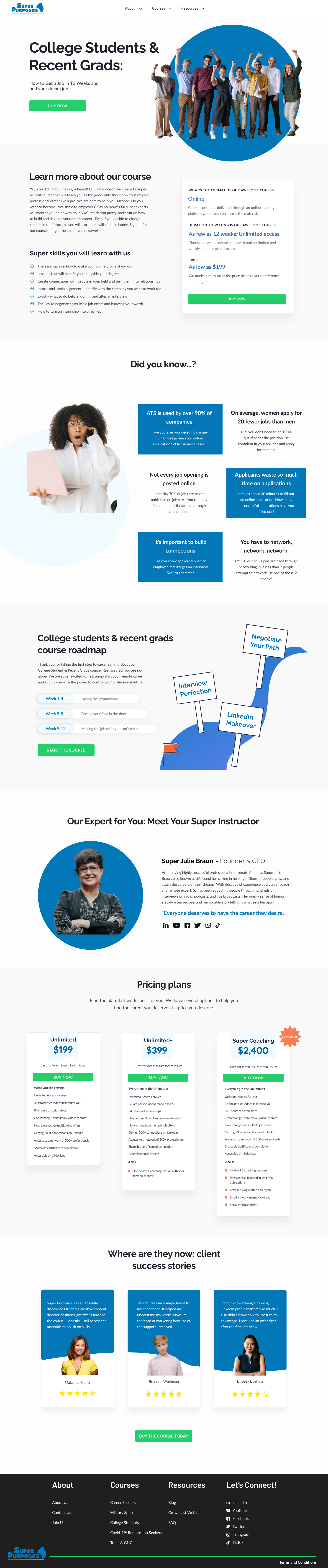
Redesigning College Students & Recent Grads course page
Introducing new typography and color schemes to fill in the gaps. Also, working on a component library and standardization
Pricing redesign
Creating a podcast page for the website
User Interviews
Interviews were conducted with 6 participants, online and recorded via video call. Participants would share their screens and narrate as they follow the tasks.
The interview consisted of navigational tasks, questions regarding pain points/wins, and demographic questions.
User Survey
To supplement the findings a user survey was conducted on 50 participants. They rated their experience and performed simple tasks.
Link to google survey here.
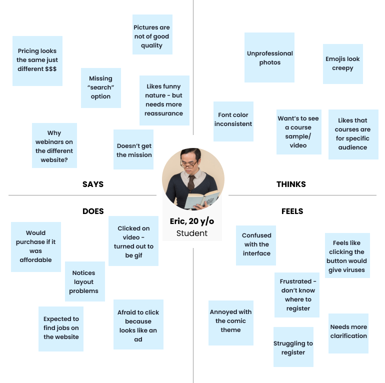
Empathy Map
Collage of sections from competitive research
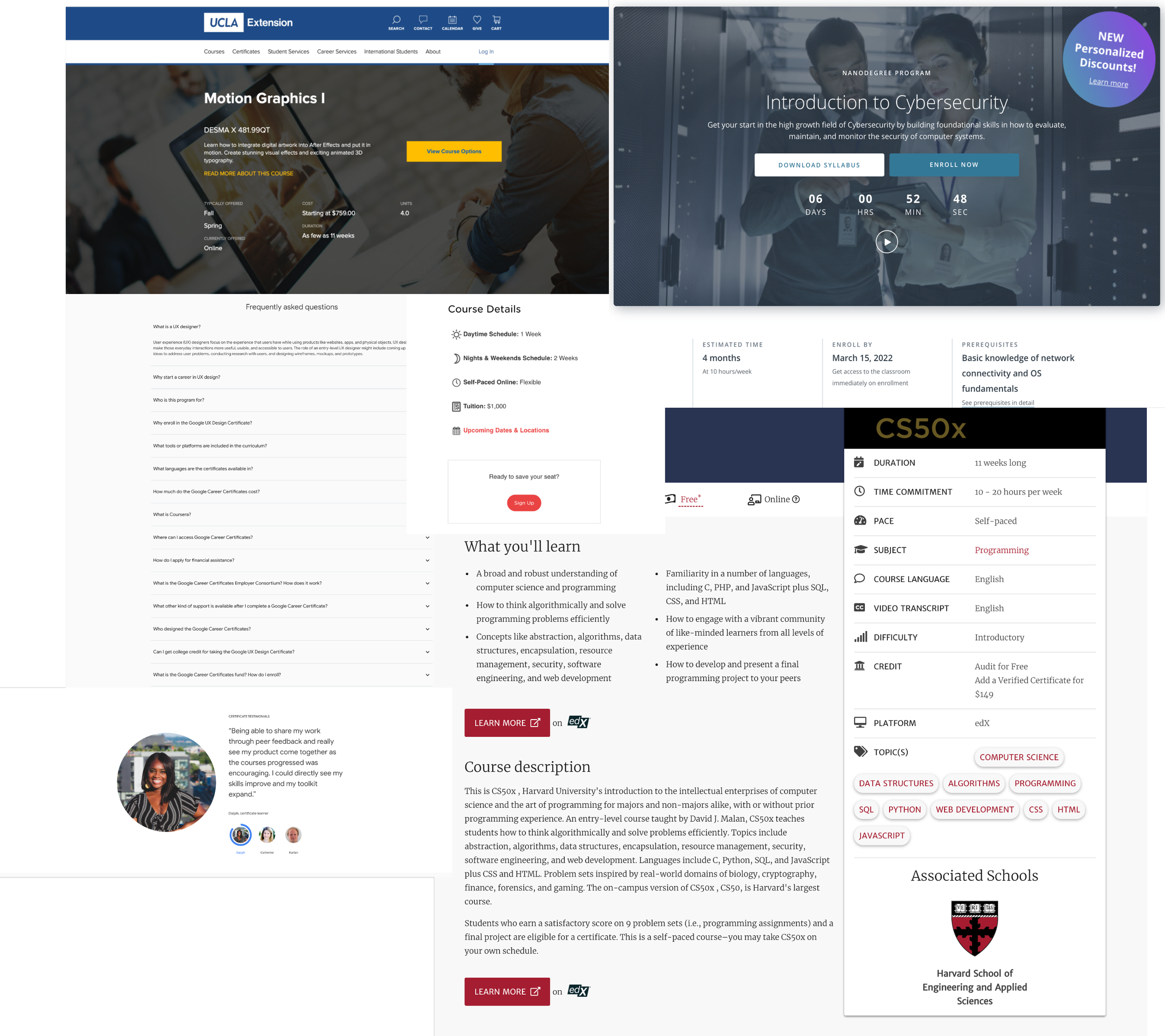
Competitive Research
I was able to find several documents related to competitive analysis, most of them focused on comparing Super Purposes to bigger subscription-based courses providers like Udemy and Coursera.
However, to understand the specifics of page architecture and what information the users expect to find I conducted my own research of 12 websites (online courses, boot camps, universities, mentorship programs) and from there identified the trends:
Overview/Description/Introduction - 12/12
Mentors/Instructors - 8/12
Syllabus/Curriculum - 6/12
What you will learn/Outcomes - 5/12
Prerequisites - 5/12
FAQs - 5/12
Course Includes/Features/What you will get - 4/12
Reviews - 4/12
Related Articles (Additional Material)/You may also like - 4/12
Business Needs
To understand the direction Super Purposes is heading in as well as technical capacities I came up with stakeholder questions that explained the following:
The vision of the company and what is missing from it
Successful purchase cases: what is the target audience vs real clients
Least/most favorite part about the website & ways to improve it
Takeaway
Super Purposes strives to be like Masterclass but with bite-sized educational videos wrapped up in a course program. Doesn’t want the website to be “too corporate” looking
The actual clientele is 30-40 y/o who are switching careers. They are the ones with enough purchasing power to afford courses. Most of them are looking for mentorship
Focus on marketing and campaigns to drive sales, introduce more video content, and new pages like podcasts and docuseries. Write more blogs to drive engagement + SEO.
Likes funny and effortless content and graphics. Annoyed at technical issues.
Redesign Goals
Based on heuristic evaluation, user survey/interviews, and usability testing I summed up user concerns to the lack of credibility.
Breaking down what diminishes credibility:
Technical & Usability Issues. Broken links, unclickable CTAs, poorly designed CSS.
Lack of Information. This includes information about courses, mentors, attendees, company, prices, and more.
Outdated and Comic Design. Both of these combined drastically decrease user satisfaction and sales.
Design
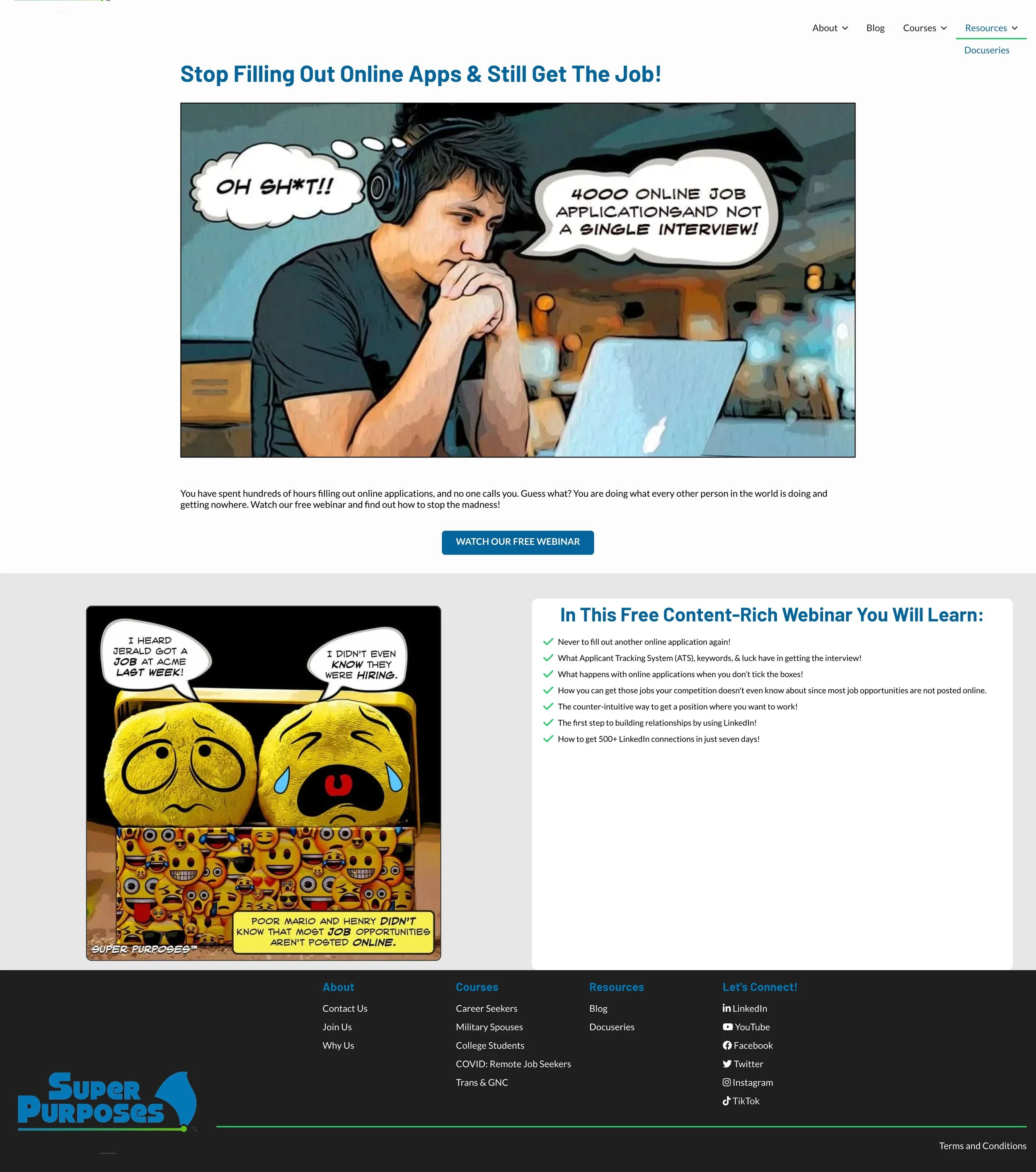
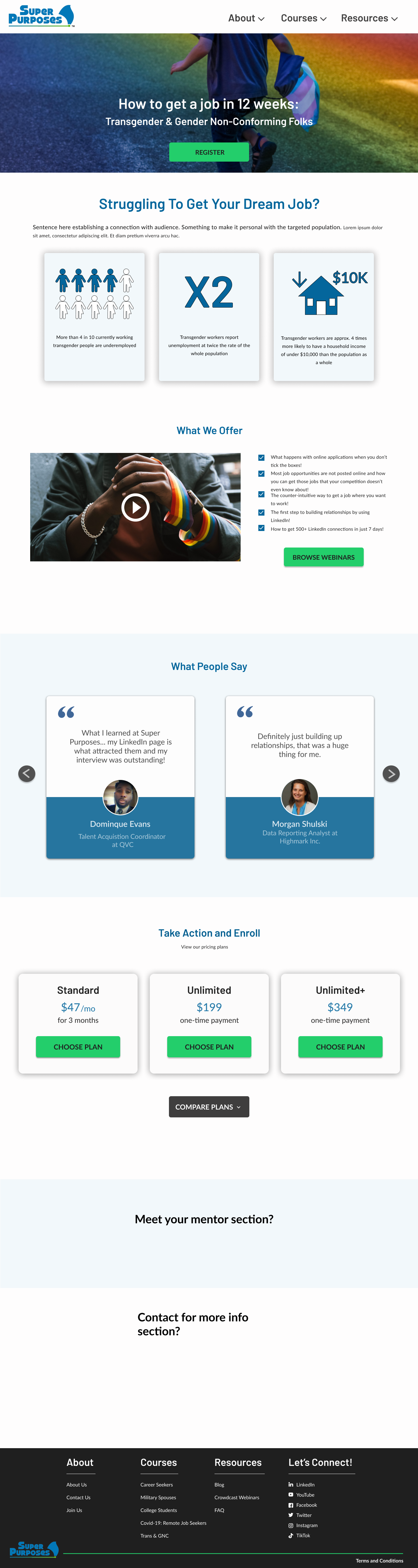
Original Design
For reference, this is how all the course pages were structured.
Little to no information about the course
No sign-in or purchase identifiers
No upfront prices
Full page screenshot
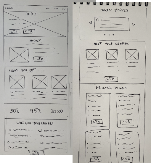
First sketches
Sketching
I started with sketching ideas for a desktop version. I made sure to follow a standard informational hierarchy: about, what’s in it, mentors, prices, and reviews.
A few sections were left out/changed during rounds of lean edits. “What you get” + “what you will learn” got condensed into one section + road map is added.
Mid/High-Fidelity Wireframing
There was a fast transition between low and high-fidelity wireframing in order to get approval and constructive critique from seniors and stakeholders. It appeared that successful cross-team communication corresponds with an increase in fidelity.
Work in Team
Each of the 5 designers had their own course pages. Our aim was to understand the best way to display each of the sections. In this fashion, it was easier to come up with ideas and get influenced. After rounds of edits, we moved on to match the designer to a section. In this way, we could use those sections as building blocks for future layouts.
Design Obstacles
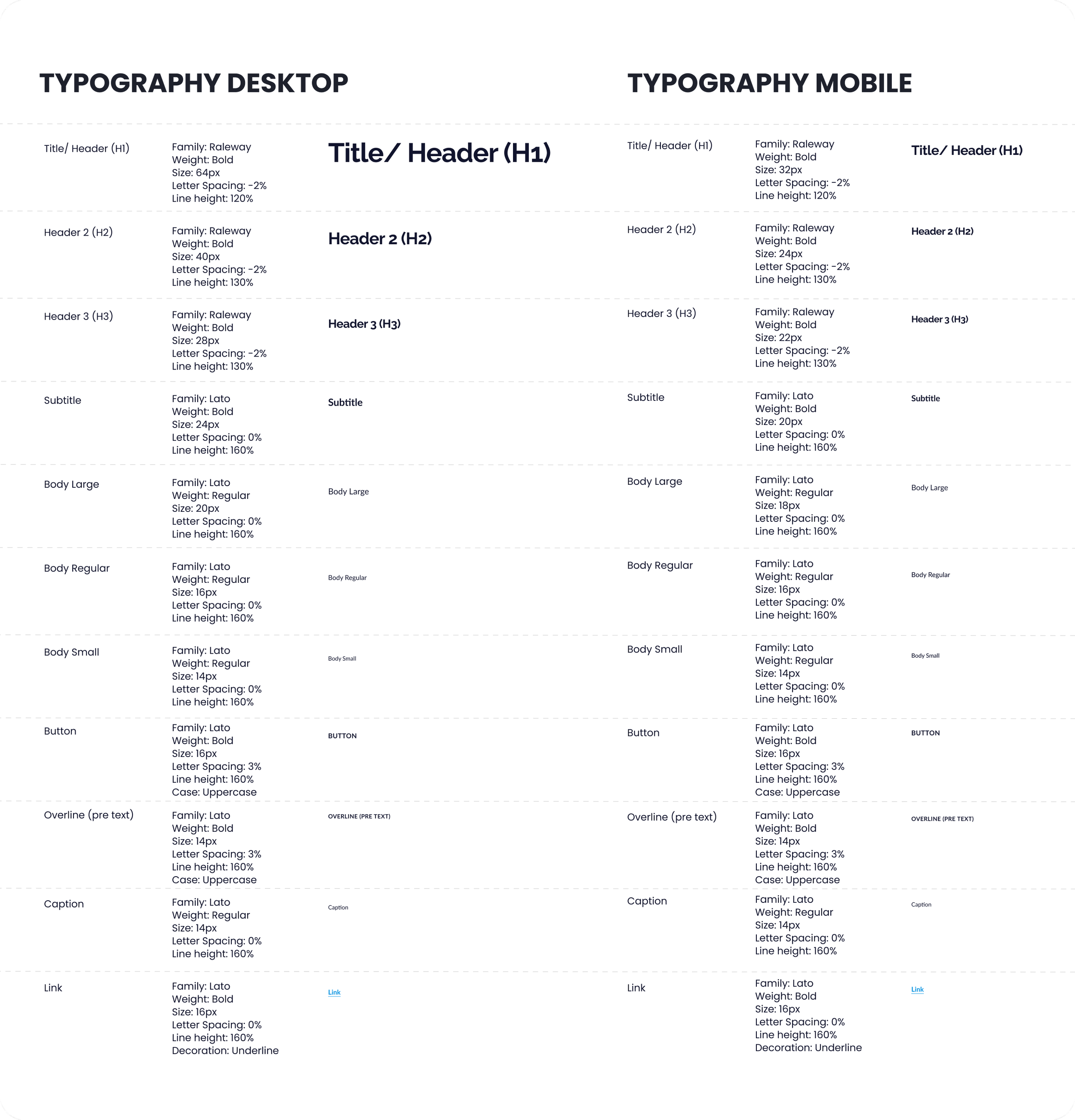
Shortly after receiving the first copy drafts, I realized the need for diversification of font sizes. Old design system styles contained “H1”, “Body” and “Button text” as the only options. It was urgent that we introduce new sizes and differentiate between desktop and mobile.
Typeface
The team and stakeholders have long displayed dissatisfaction with the header font “Barlow”. Because of its “corporate” and condensed look.
The choice fell on Raleway as a new typeface to complement Lato. The reason to leave Lato was that it was condensed enough for long reads and a mobile version.
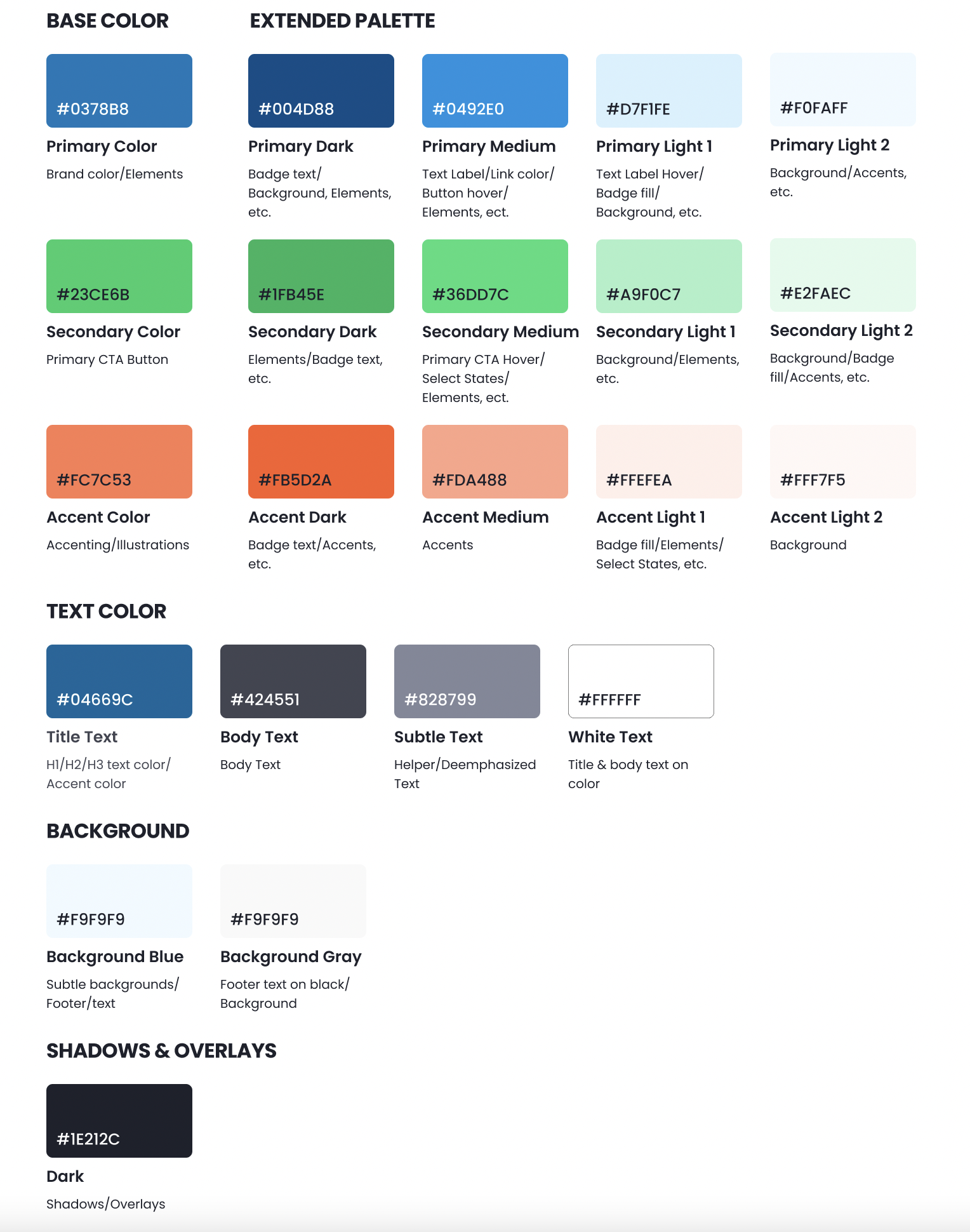
Old Design System
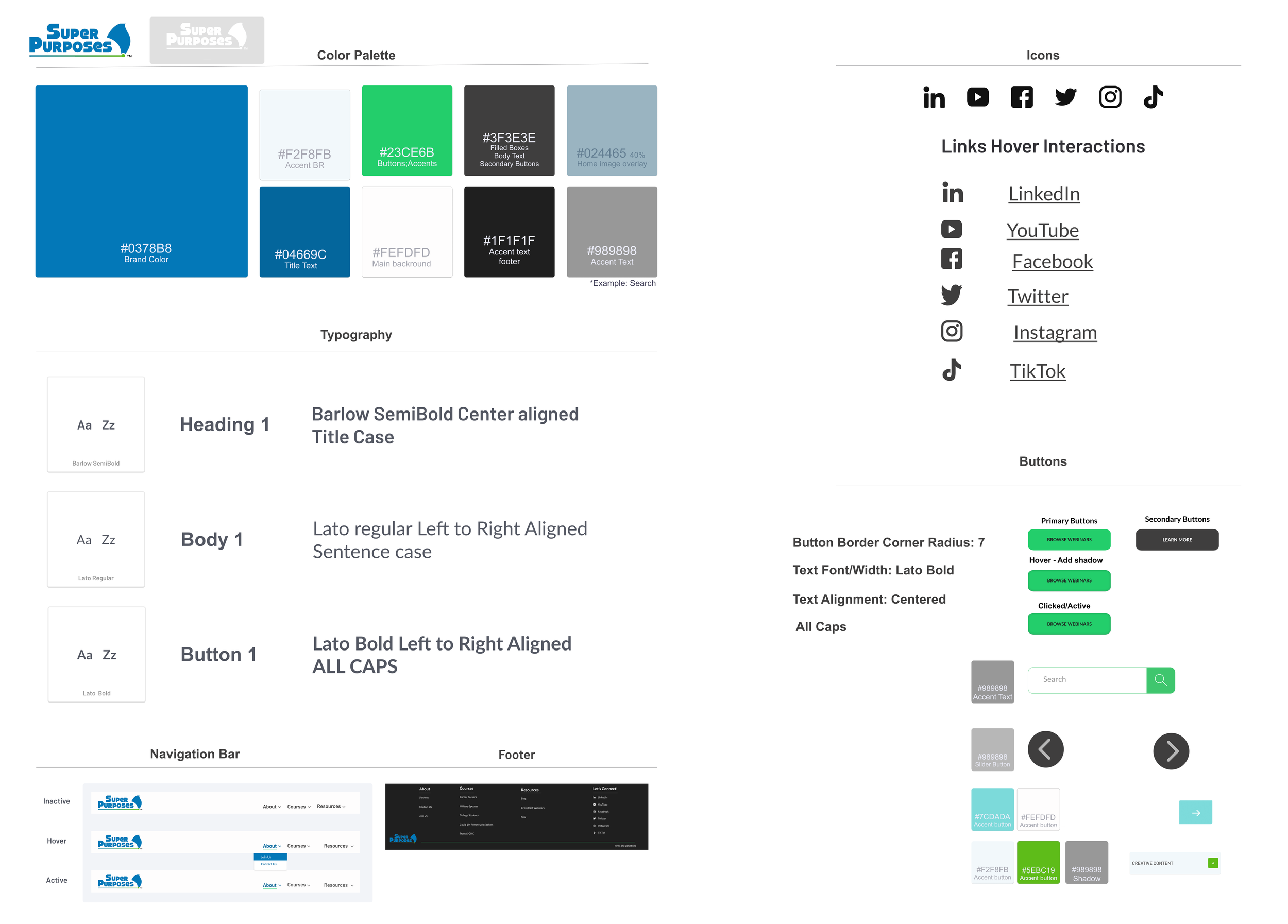
Updated Design System

Additional & Final Edits
Hero image. It was determined that the new design theme is image photography. That’s why the filled hero image was the most popular choice
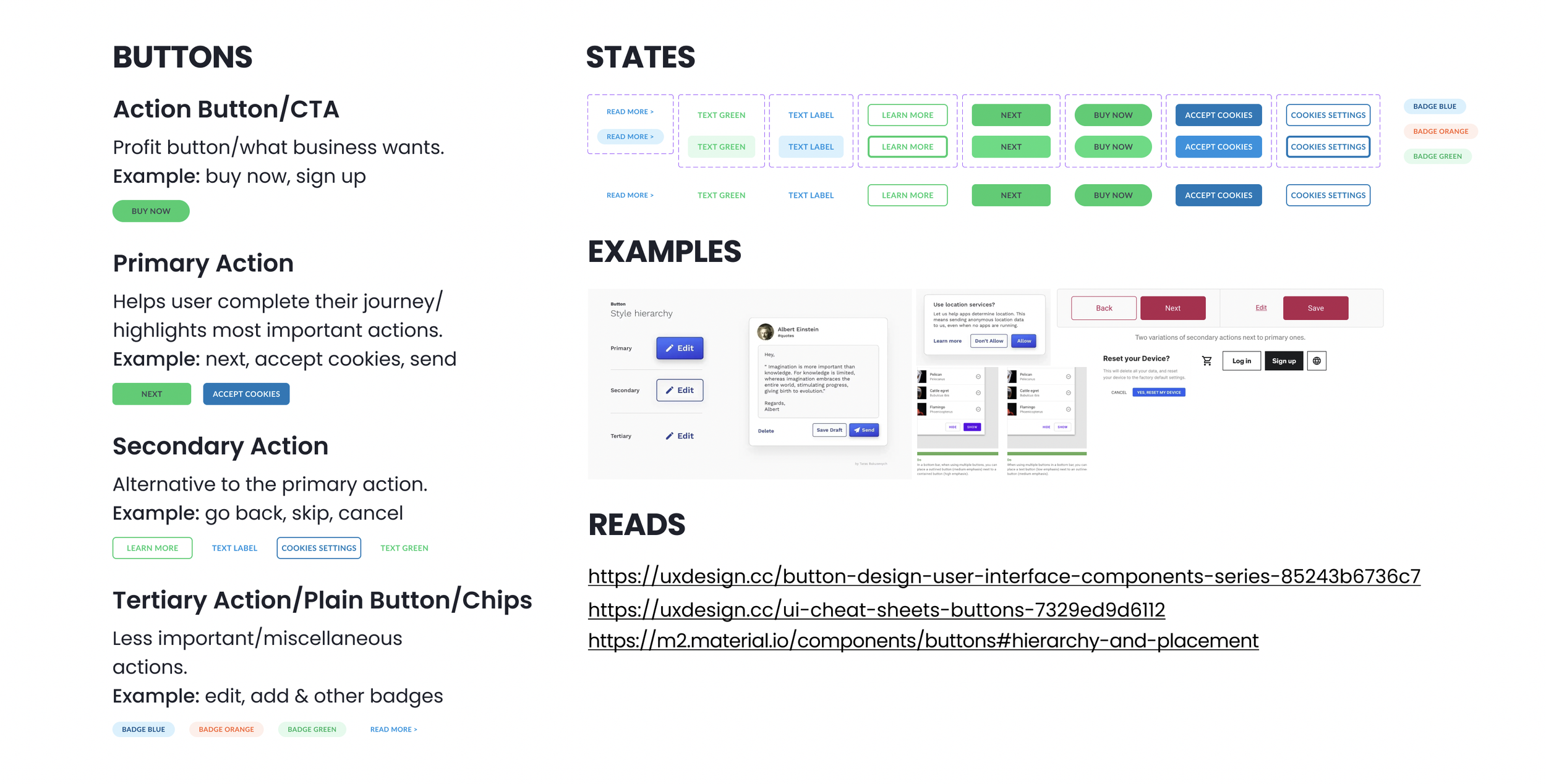
Buttons. After running CTA frames through the A11y accessibility checker, I was convinced to stick with the dark text on the brand’s green color to comply with WCAG 2.0 standards
Pricing. This section went from a table to a 3 card design with detailed descriptions of the perks that come with each option
Client success stories. Originally the trend was to pursue the carousel layout but after further investigation, the team agreed that displaying three reviews at once was a better strategy
Title text. To comply with the styling standards we used brand color for title text


Deliver
Final Design
Though this is the most recent approved design, as with most of the pages it is in a state of fluidity. Further user tests should be performed to understand the impact of design and marketing decisions made. As well as testing technical possibilities.

Next Steps
To make sure that we achieved the goal of providing users with a decent amount of information to boost credibility we would have to run user tests with a crowd unfamiliar with Super Purposes to prevent biases.
To see the live version click here.
Upcoming Improvements
There is a need for standardized top and bottom navigation
Potential conversion of “sample class” & “play video” buttons into icons
FAQ section
Introducing “additional resources” to promote blogs and other topic-related media.
Transitioning to PMP Pro would enable users to login into their cabinet straight from the website, this will also prevent using Kartra as a third-party service to process the payments.