KoinStreet - Landing Page Redesign
UX Methods
User surveys, Heuristic analysis, Comparative research, Wireframing
Role(Sole)
UX Designer
Tools
Sketch
Duration
Five days
Background
New crypto startups, whether it’s ICO’s, trading platforms, or exchanges, often face negative stigma simply because there have been unfortunate cases in the past. With that in mind, I started to work on redesigning an existing landing page to attract more users for my client.
Problem
Building trust around any new crypto trading/investment project that is dealing with such intimate things as money is key to getting users onboard and making them use their assets safely.
Solution
I will be focusing on creating an informative and trustworthy website to make sure that the user won't second guess the product and get as much information as they need to get things started.
Discover
Comparative Research
I started with comparative research to understand the best practices used in this field. I browsed websites related to crypto trading platforms, finance, and loans to better understand design patterns, information architecture, and marketing tactics.
Heuristic Analysis
Additionally, I looked into NN group findings to help compile a list of features that would elevate the feeling of safety and user experience with Koinstreet.com.
User Survey
It is essential to test the running website to get insights into the issues that users are experiencing and prove the hypothesis. I created a google survey with 7 questions and posted them on crypto subreddits.
Comparative Research Findings
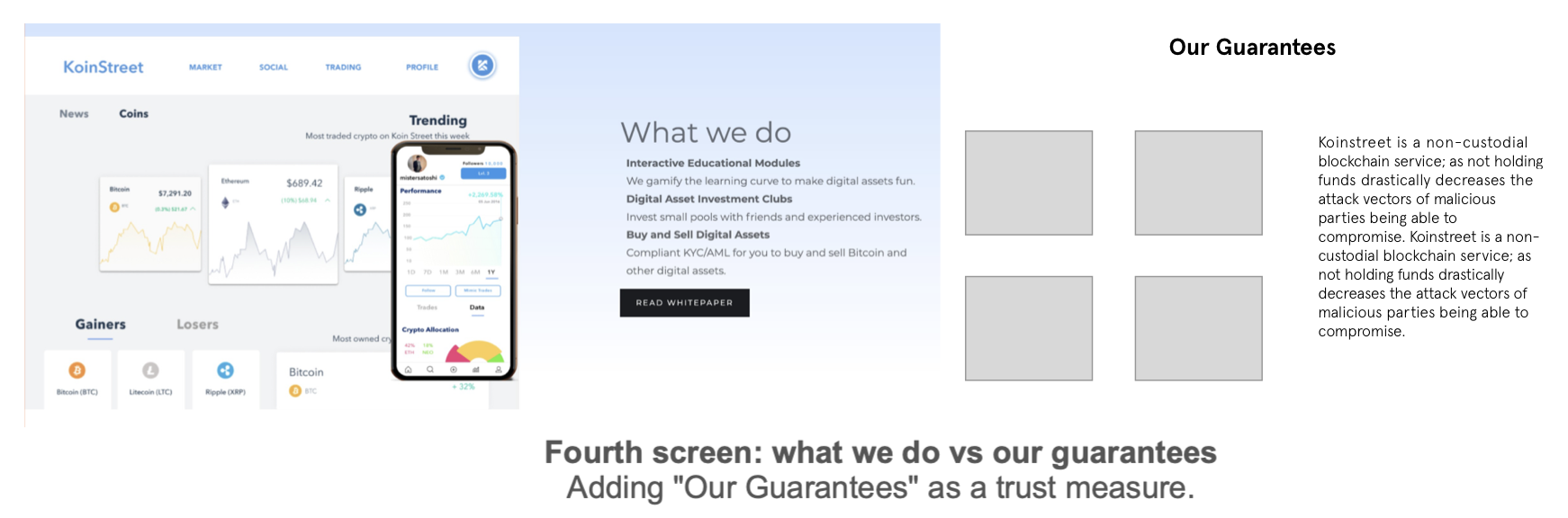
What I found out through comparative research of over 10 websites proved that it’s important to build trust with the user. Most of the websites use the following content blocks to boost credibility.

Kraken.com
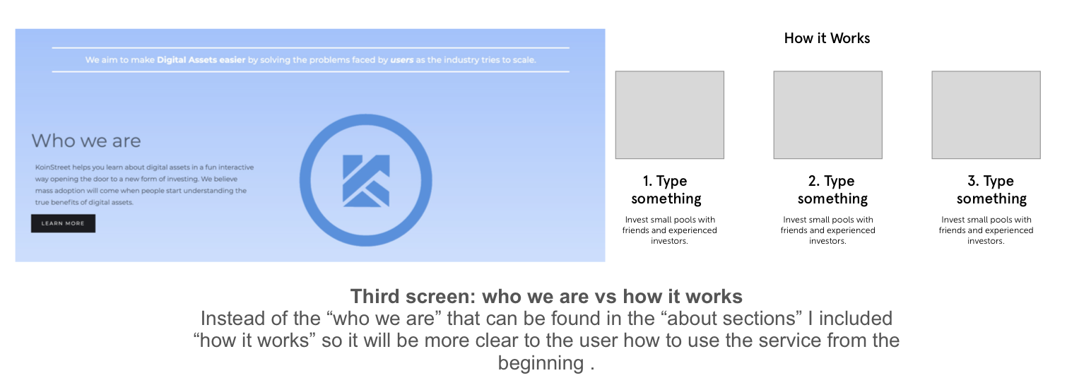
Having a "How it Works" or Q&A part helps the user to understand the process more and sell the product by making it more familiar.

Coinbase.com
Dedicating a "Why Trust Us" block on the landing page.
A breakdown with information about storage, insurance, and support of top cryptocurrencies.
Lolli.com
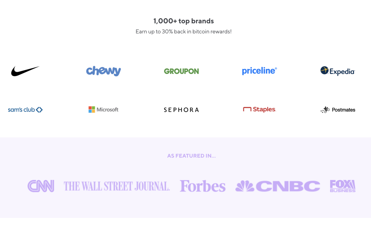
Partnering up with known brands and media also builds trust.

Survey Findings
The reason behind posting this survey on crypto subreddits is that there are more potentially crypto-savvy users. And the target audience of my client is users who know the basics of trading. As can be seen on the chart, there was not a single crypto unsavvy respondent who participated in the survey. This in turn validated the other responses.

Content Structure Findings
These are the content blocks that I found to be the most useful for Koinstreeet that elevate transparency. Highlighted are the ones that were already included in the original website design.
Define
Problem: The surveys showed that there is room for improvement when it comes to information structure, delivering the idea, and trust. We want to make sure that the user won't consider this website a scam.
Open-ended questions contained a lot of insights that I compiled into trends:
1. There was a good amount of people that said it “looks good”. And that the website is “sleek, modern, informative.” (3 answers)
2. Another group pointed out that the website needs improvements “I think you need to focus in on what you do very well / better than others. Don’t try to do everything.” (4 answers).
Overall, 50% of the people mentioned that they would use the website. The others said “ Seems like you’re promising the world.” and “No. It’s another crypto data website”
When it comes to trust:
People who assessed themselves as “experts” had a lower level of trust towards the Koinstreet website. Whereas, people who appeared to know less were more likely to rate it higher on the trust chart.
Design
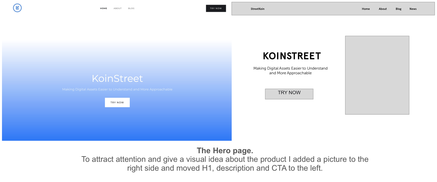
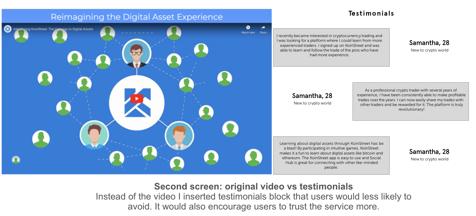
In order to see how the content flow will look like I created some low fi screens and compared them to the original website.

Typeface & Color Selection

Typeface
I got inspired by Kraken font and visuals and decided to try something like Museo Sans on this landing, it looks younger, somewhat playful, and works well with Apercu. The reason behind this was that KoinStreet introduced an internal token called Kash to gamify the experience on the platform. This font pair translates the idea of gamification, attracting a young crowd (the average age of the respondents is18-25).

Color
The dominant color - blue was taken from the logo, it means stability, trust, confidence. I decided to pair it up with blush pink as a contrast color to make it a little more playful. And also include a turquoise blue for a better gradient.
Deliver

Reflections
Improved competitive/comparative analysis skills
Analyzing more than 10 websites related to crypto exchange and other various financial platforms helped me understand the design patterns and must-haves as well as providing general information into the subject to have a better perspective on my client's project.
Prepare even for the non-formal interviews
Continuous behind-the-scenes non-formal interviews with friends, mentors and other acquaintances who own crypto and are familiar with the subject helped to create the plan and sticking to it as I progressed with my designs.
I was also thrilled to start the project since I believe this topic to be the future of currencies and non-centralized ownership of the money. Also, combining UI and UX and working on the landing page has been one of the most exciting and challenging things.
Have several color options for the A/B test
And the last but not least, I would possibly consider changing the color scheme into something more serious to see if the respondents would feel more secure using the platform.